Estimated reading time: 18 minutes
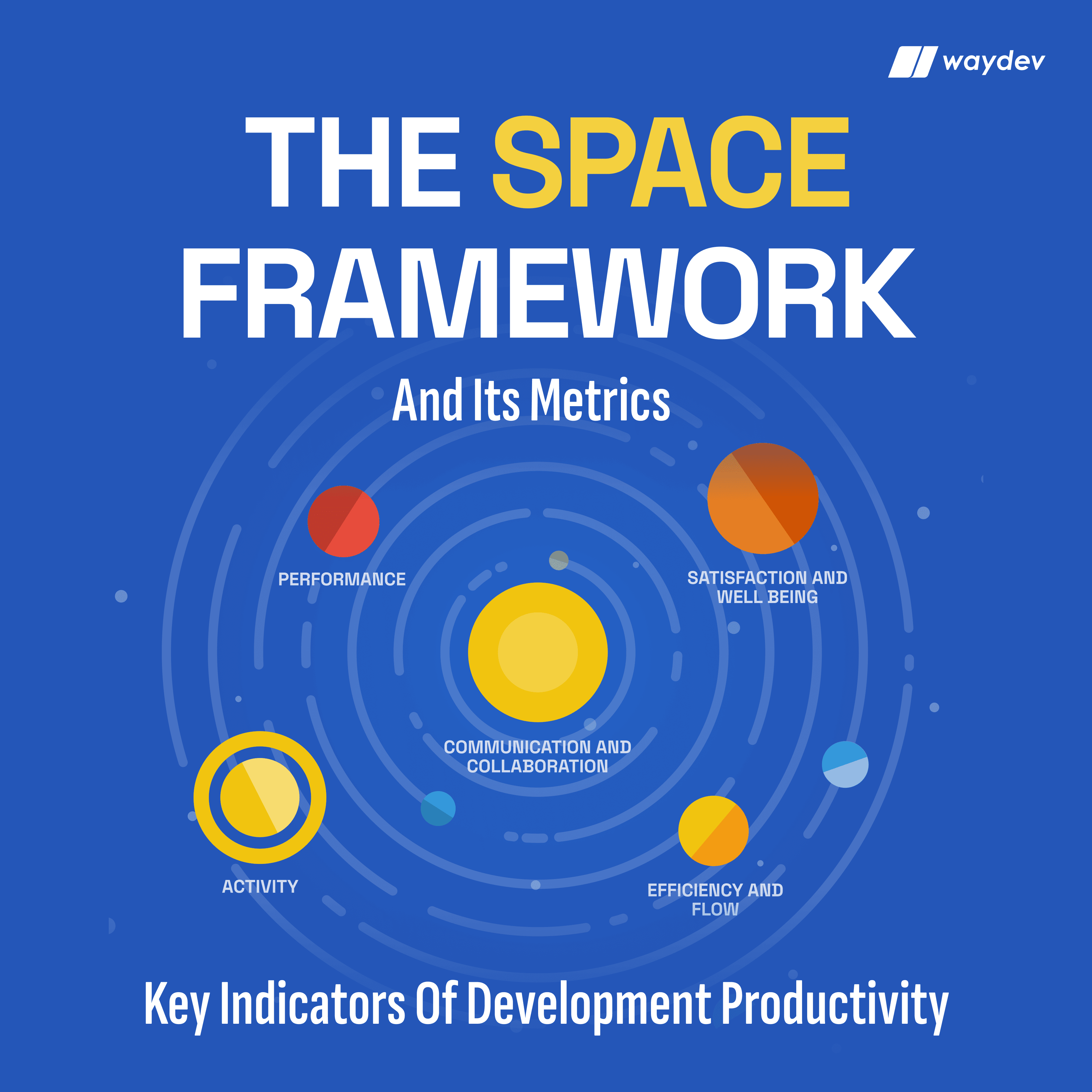
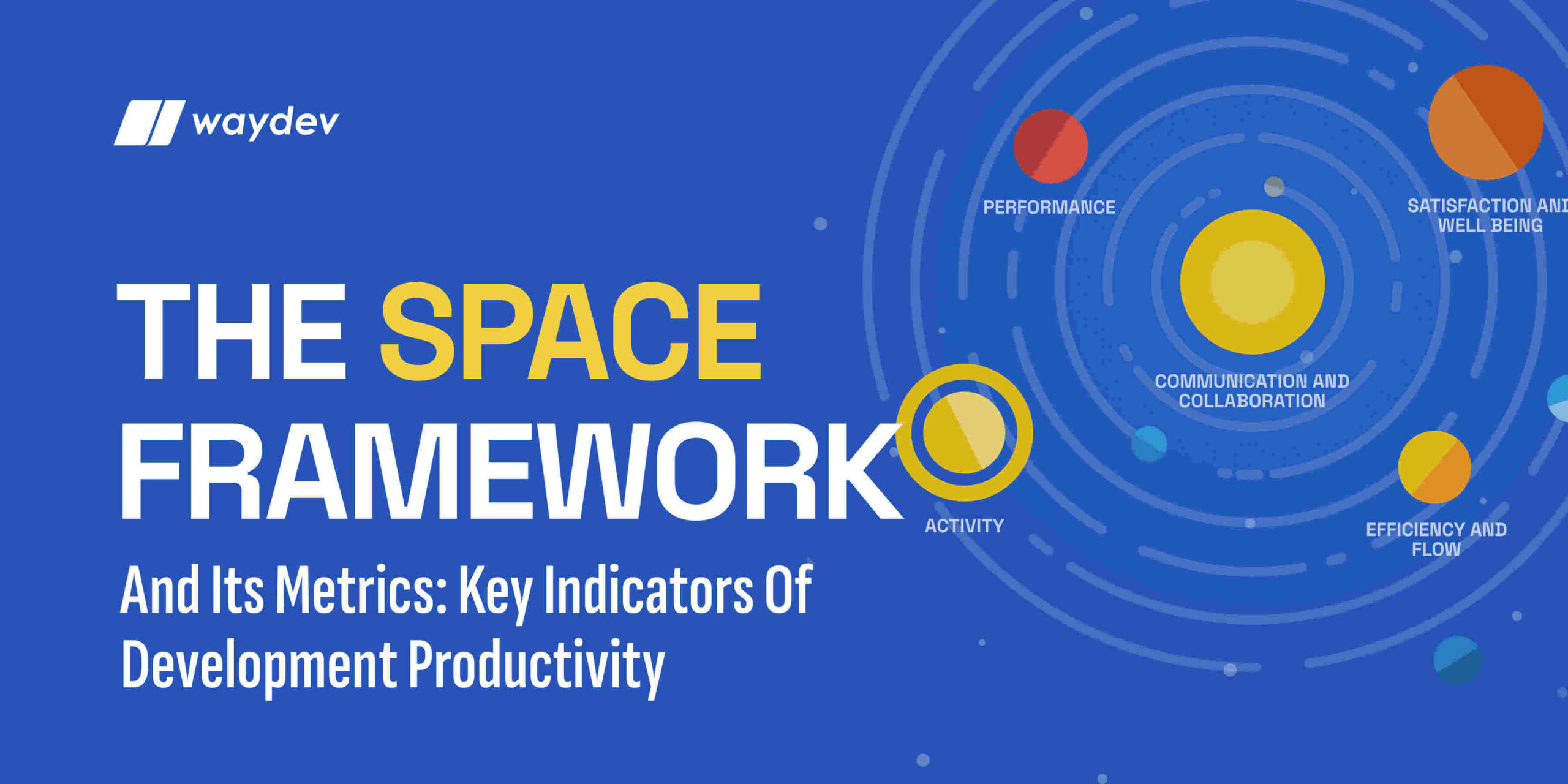
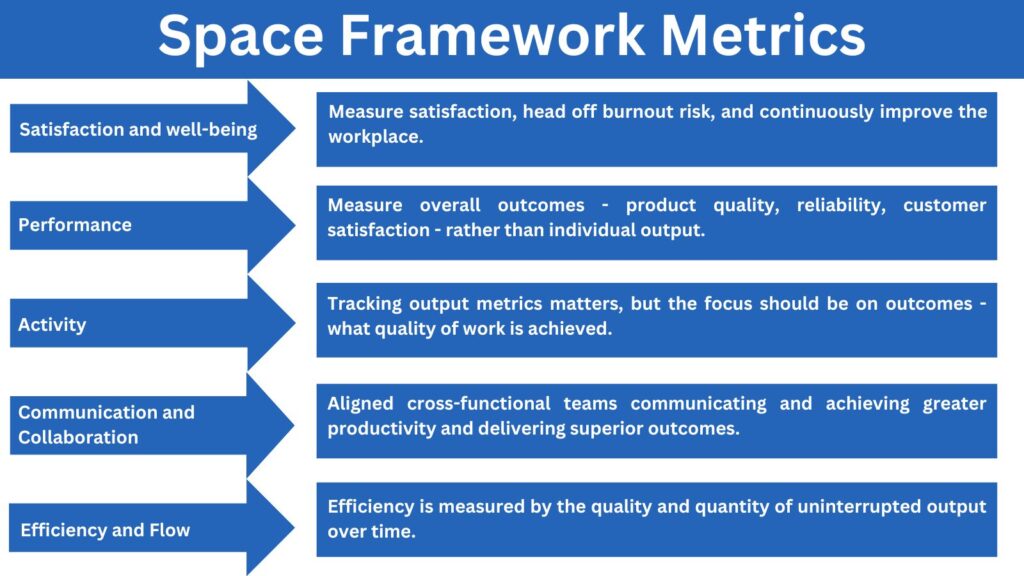
Space metrics are the five measurable dimensions inside the SPACE framework: Satisfaction and well-being, Performance, Activity, Communication and collaboration, and Efficiency and flow. Together, these dimensions give engineering leaders a way to assess team productivity that goes beyond lines of code or ticket counts. Each letter in the SPACE acronym maps to a distinct signal, and using them in combination paints a far more accurate picture of how a software team is actually functioning than any single output measure could.
As an executive for your company, it’s very important to understand how productive your teams are and what could enhance that and lead to breakthroughs in your project. Although this task may seem overwhelming, there are specific metrics that you can use and coordinate them with other methods (surveys, brainstorming).
Waydev encompasses the DORA metrics showcasing complex data about your teams’ activity or performance to help you get a clearer picture of how efficient processes are. As a VP of Engineering or CTO, you will have multiple dashboards that are fed with data about the processes your teams are working on, without requiring any manual input from engineers or managers.

What is the SPACE framework? SPACE Framework is a way to measure productivity of software engineering teams by using a full approach. The general criterion for evaluating written code tends to be measured in quantity and how fast it gets delivered. But that doesn’t really tell you anything about the quality of the outcome. This is where more refined methods of evaluating performance through other metrics come into play. When you are a VP of engineering or a CTO for a software development company, clearly understanding how your software development teams are doing and where there’s room for improvement is important. This can make or break the success of your finished product and, ultimately, that of your entire company.
SPACE Framework was developed by the same entities that created the DORA Metrics – technology savants from GitHub, Microsoft Research and the University of Victoria, led by Dr. Nicole Forsgren (VP of Research & Strategy at GitHub, who was one of the original inventors of DORA Metrics). The study called The SPACE of Developer Productivity was originally published in Queue, in 2021. It sheds light on the intricacies of understanding what engineering productivity really entails, filtering all the myths and misconceptions.
The researchers put a number of complex key metrics for software development in a framework to have a complete overall view of what it takes to have productive teams within your company. Although the original study concentrates on development and engineering teams, this multidimensional evaluation system can be applied in any type of organization preoccupied with increasing productivity and results. It also shows how you can apply these measures in practice to understand better how your software development teams work and helps you create better measures to improve their overall performance.
Motivation is key in any professional environment, employees that are motivated will do a better and more consistent job. According to research, productivity increases when you feel happy at work and have little frustration, finding ways to decrease this is a key element when you are a high-level executive in charge of multiple teams.
If you are a VP of Engineering within a technology company, you need to consider if your team members are happy with their workplace and if they would recommend it to others. This tells you whether you are nurturing a healthy work culture where employees feel they are heard and their needs matter.
General well-being of your team also focuses on evaluating if the engineers have the necessary tools and resources to complete their tasks. If there are gaps in this area, frustration will occur and impair their ability to stay in a good mind frame.
By evaluating satisfaction and well-being within your organization, you can stay on top of things at all times. What’s more, you can also see potential issues within the system. For example, if you see your team working very long hours, this could tell you they are very productive,but it could also be an indicator they have difficulties completing their tasks in a timely manner – maybe procedures need to be optimized, they don’t have the best tools or other factors are causing roadblocks. In order to keep a positive work environment and prevent burnout, you need to properly assess these situations before they turn into problems.
Properly assessing how satisfied your employees are is no easy task. There is no magic formula or a straightforward metric to get all the answers for this one. But some indicators can point you in the right direction, conducting direct surveys within your teams is an effective way of learning firsthand how your employees perceive their SPACE framework for the workplace and where there’s room for improvement. It’s essential to cultivate a healthy work environment where team members feel they have a safe space in which they’re comfortable giving straight and honest answers.

Performance in a general sense within an organization refers to evaluating your team members’ results and successful projects/ completion of projects. This can mean anything from the quality of their results to how satisfied the users are with their work. But sometimes when everything is done within a team, it’s hard to say who brought what to the table for the final result.
It’s particularly difficult to quantify performance when it comes to individual contributors within a technology company. Oftentimes you can’t correlate individual performance with a general outcome of the final product because the code written by one engineer is a piece that fits the puzzle, and very rarely can be considered ground-breaking work. The success of an end-product is more about teamwork than any one individual’s direct contribution.
Rather than focusing on one member’s results, performance SPACE framework metrics focus on the overall outcome and the quality of the results. This means taking into account code quality and how reliable it is in detriment of code quantity – in other words, outcome over output is a better indication of performance. Assessing customer satisfaction with the final product is also a valid way of measuring the team’s success with a project.
A teams activity refers to output – what tasks has the team manage to complete in a given amount of time. But this notion needs to take into account many smaller or bigger stages that make up the team’s professional life. This can be measurable work or deliverables, but also invisible work – brainstorming sessions, preparing for meetings, or research to complete the tasks.
Software development teams’ activity encompass a number of steps that form their daily undertakings. Depending on their specific tasks and current projects, these pursuits may entail writing code, deployment, testing activities, or product design. Meetings and brainstorming sessions are also important parts of the daily tasks, so everything must be taken into account when logging activity.
As mentioned above, tracking the team’s productivity is not just about output, but more about outcome. So measuring the activity of your teams is important, of course, but it shouldn’t be your only focus. The SPACE Framework tells us that putting everything in context is key, rather than just logging the amount of code written or how many hours an engineerput in.
Communication within a team and between multiple teams is what drives a project forward. It’s t about teams coming together for the best outcome. The success of the team in bringing quality results is what will drive the organization forward.
Efficient communication and collaboration between team members is important and will increase productivity. In order to achieve this, there are a few key elements that need to be present, such as full transparency over the workload and potential roadblocks each member might encounter. Being able to track your teams’ work and having access at all times will make collaboration easier and more effective. Communication ensures a good workflow and integration of work, and this will result in less blockages along the way.
As a VP of Engineering, this is a good place to encourage collaboration between team members and different teams, rather than individualism and solo work. Doing this will promote a healthier work environment and ultimately a better and more supportive culture.

Efficiency can be measured in terms of the amount of quality results produced. What’s more, you can also assess how smooth your developer productivity workflow is by seeing how much uninterrupted time they spend on specific tasks. The less roadblocks and interruptions they have, the faster and more efficient the output will be. Take into account how much time it takes to progress a task from one stage to the next with minimal waste of resources.
Productive time can be defined as the time spent focused on completing tasks and getting into a flow. Finding ways to optimize this process and thus stimulate productivity is no easy task. The real challenge is to identify what it takes to get in that state of flow and how to replicate this in a controlled environment. What does it take for your team members to reach this state of high focus and be as productive as they possibly can?
But there are some traps with the concept of optimizing efficiency and flow on an individual level. Minimal interruptions may mean an engineeris more productive and focused, but it may also mean isolating oneself from the teams, so this decreases collaboration and communication. Less brainstorming sessions to avoid interruption may lead to less creative solutions and breakthroughs that drive a project forward. As with anything else in business and in life, balance is key.
As a VP of Engineering in a technology company, it is important to constantly find new ways of evaluating your team’s productivity. Keeping yourself informed at all times about your development teams will give you precious insight and predictability into outcomes and results. Keeping a close eye on how your teams are doing and where there are flaws will help you in finding solutions to improve general workflow and quality of the finished product.
The SPACE Framework seeks to redefine how productivity assessment is done in software development companies and way beyond them; evaluating how and under what circumstances your teams become more productive is no easy task. Generally, we can say there is no specific formula to assess how people function in a work environment and how you, as an executive in charge, can stimulate that. But the SPACE Framework challenges those boundaries and proposes a full approach that encompasses extensive data to give you a clearer view than ever before.
But how do you measure your teams’ productivity and what type of metrics do you use for this intricate and complex task? Continue reading to get an insight into how you apply SPACE metrics in practice to analyze the success and performance of your team. Keep in mind that what you prioritize in terms of metrics to assess productivity sends a message to your teams about the most important KPIs for your company. Is it just about the amount of code written and the velocity of output or are satisfaction and retention of loyal employees also important?

Assessing employees’ satisfaction within the workplace is not easy. Assessing employees’ satisfaction within the workplace is not easy. After all, how happy someone is at his job is a purely subjective and personal perception, so it is not easily quantifiable through the standard DORA Space Framework metrics.
However, there are some pointers that you can use as a guide when trying to determine if an employee feels like they are a valued member of the team. Here are some guidelines to follow when measuring engineers satisfaction and well-being within the company:
Evaluating a single employee’s performance is not always straightforward or easy. Assessing how that person fits as part of the team is more doable, and assessing that team’s overall success is a more achievable task. Here are a few specific Space Framework metrics that can help you in your endeavors:
The overall activity of your team includes brainstorming sessions, meetings, correcting certain steps or problem-solving. These must also be taken into account when evaluating a team’s general output. However, there are some specific metrics that can quantify your team members’ activity:

The SPACE Framework is an innovative way of looking at productivity within an organization that stands out from anything we have seen before. It’s not just about rigid metrics and measuring performance in terms of volume of delivered products and understanding its importance is key to moving your business forward. SPACE metrics doesn’t just give you a series of standard metrics, but it changes mentalities and it opens new doors in understanding how to improve productivity at an organization level.
SPACE Framework Engineering also debunks myths that keep you from getting to the root of how your team functions at its peak. High level executives understand that there is no single metric that will tell you all you need to know. There are many variables in terms of general performance and no such thing as a one-size-fits-all measurement tool in this area of evaluation. You need several complex metrics and to put them in context because teams, projects and organizations are different.
Comparing them based solely on a few rigid metrics without integrating them in your specific context holds little value. What’s more, different teams function differently – being more efficient won’t look the same for everyone.
Another key point in assessing your team’s overall success is always focusing on the big picture, and not individuals. Metrics that only look at individual performance don’t give you much of an
Ready to unlock your SDLC productivity?