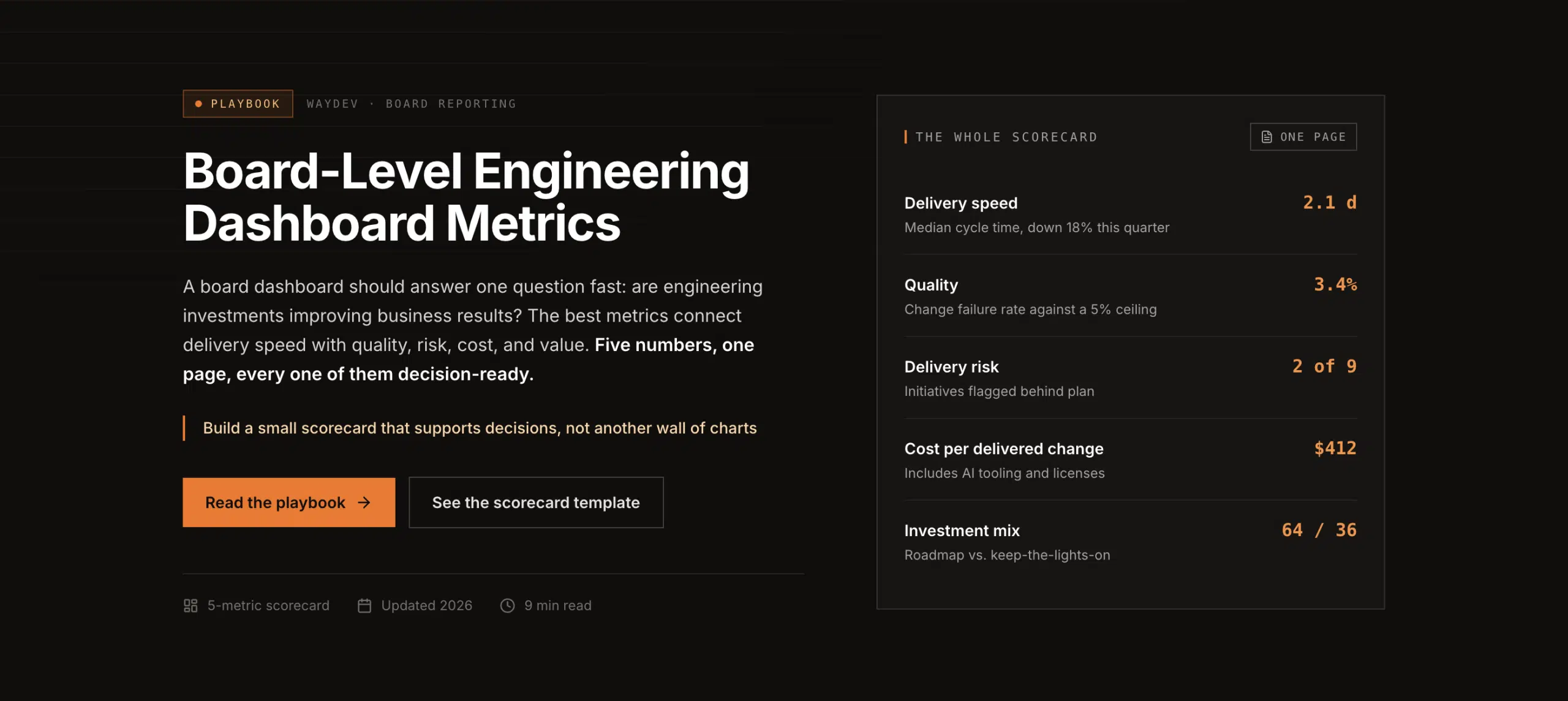
A board dashboard should answer one question fast: are engineering investments improving business results? The best metrics to include on a board-level engineering dashboard connect delivery speed with quality, risk, cost, and value. Use the steps below to build a small scorecard that supports decisions instead of creating another wall of charts.
Start with the business decision, not the data you already have. The key metrics to include on a board-level engineering dashboard should explain whether engineering is helping the company grow, protect revenue, reduce cost, or lower risk.
Write each metric as a question. This keeps the dashboard tied to action.
Next, connect each question to one business outcome. Revenue enabled may come from a new product capability. Revenue protected may come from reliability work. Cost avoided may come from automation. Risk reduced may come from security fixes or better controls.
This link matters because technical activity has little meaning by itself. A rise in merged pull requests does not prove better performance. A shorter cycle time may help, but only if quality holds and the work supports a business goal.
Define each KPI before you put it on a card. Write down its formula, time window, data source, owner, and direction of good performance. Also state what the metric cannot tell you. That last part stops leaders from treating one signal as a full diagnosis.
Keep the executive layer to four to six main measures. Put team, service, and value-stream detail behind each card. Waydev uses this type of engineering intelligence view to give leaders granular visibility without turning the board meeting into a data review.
For a useful starting structure, use this dashboard framework to separate delivery, reliability, investment, and business outcomes. By now you should have a short list of board questions with one owner and one decision tied to each.
The core metrics in a board-level engineering dashboard should show flow and safety together. Never report speed without a quality check beside it.
Start with the four DORA measures. Deployment frequency shows how often teams release code. Lead time for changes measures how long a committed change takes to reach production. Change failure rate shows how often releases cause failure. Mean time to recovery, or MTTR, shows how quickly service returns after an incident.
Track these as a group. A rise in deployment frequency looks good until change failure rate rises with it. A shorter lead time is less useful when incident recovery takes longer.
Add a small set of quality and flow signals:
Use team or product trends, not individual rankings. The board needs to know where delivery is blocked, where risk is rising, and whether an investment is changing the system. Individual activity counts invite the wrong behavior and rarely explain business performance.
The four delivery measures provide a way to assess software delivery performance. Use the same definition across teams. If one group counts a deployment differently, the comparison loses value.
Show the current value beside a target and a prior-period trend. A number without context forces the board to guess. Use a line chart for movement over time. Use a bar chart when comparing value streams. Reserve red and green for decisions that need attention, since constant color makes every item look urgent.

By now you should have a core scorecard that balances delivery speed with release safety. The next step is to show what AI and engineering spend are changing.
AI adoption belongs on the board dashboard only when it connects to an outcome. License counts and login totals show access. They do not show value.
Measure adoption in stages. Access means a person can use the tool. Task use means AI helps with a defined activity, such as code suggestions or test support. Workflow use means AI sits inside a repeatable process with an owner and a measured result.
For each AI use case, pair one usage signal with an outcome signal:
Keep the comparison fair. Establish a baseline before rollout. Use the same time window after adoption. Segment results by team, tool, and workflow. A company-wide average can hide a useful result in one product group or a quality problem in another.
For CFO review, group value into four buckets: revenue enabled, revenue protected, cost avoided, and risk reduced. Then show total cost of ownership. Include license spend, integration work, security review, administration, and quality costs caused by the change.
A simple capacity model can translate time saved into money: verified hours saved multiplied by loaded hourly cost, working weeks, and a realization rate. Treat that result as an estimate. State the assumptions beside it. Do not present theoretical capacity as cash savings unless the business can actually realize it.
Waydev helps engineering leaders connect AI adoption with delivery, quality, and ROI signals. Its Ask Waydev experience, AI Checkpoints, Signals, and Predict & Improve concepts fit a board view when they answer a clear investment question. The point is measurement, not more tool usage.
For CFO review, use a decision page to show baseline, current result, full cost, payback, and risk. By now you should have an AI scorecard that shows adoption depth and business effect.
The best metrics to include on a board-level engineering dashboard are only useful when the data is consistent. Build the data path before you polish the charts.
List each source and its event fields. Common inputs include Git activity, pull request events, issue tracking data, CI/CD pipeline records, deployment logs, observability data, incident systems, security tools, and finance records.
Give every metric a clear source of truth. Define the time zone. Define which repositories, services, teams, and deployments are in scope. Record exclusions. A metric dictionary should also include refresh cadence, formula, owner, and change history.
Use automated pipelines where possible. Manual spreadsheet updates may work for a small pilot, but they create stale values and hidden edits at enterprise scale. Excel can help test a model. A BI layer or engineering intelligence platform is better for recurring refresh, permissions, drill-downs, and shared definitions.
Design the dashboard in layers:
Use cards for current status. Use line charts for trends. Use tables for exceptions. A heat map can show concentration of risk across services. A waterfall chart can explain how engineering cost becomes capacity or value. Use a Sankey diagram only when the flow is hard to explain with a simpler chart.
Set refresh rules based on use. A board pack may need a daily refresh. An incident view may need near-real-time data. Add alerts for threshold breaches, but send them to an owner with a defined response. An alert without a decision rule becomes background noise.
Protect access by role. The board may see organization-level trends while engineering leaders see product detail. Sensitive security or cost fields may need separate permissions. Waydev can serve as the intelligence layer when you need data from the SDLC combined into team and organization views.
Test every card against the source system. Pick one deployment and trace it through the pipeline, dashboard calculation, and final display. If the count differs, stop and fix the definition before presenting it.
Design determines whether leaders can understand the dashboard at a glance. Put the most important metric in the strongest visual position. Group related cards. Keep labels plain and include the time window.
Show target, current value, and trend together. A status color should answer a question, such as whether a target is on track. Do not color every card. Too many signals compete for attention.
Tailor the view to the audience. A CFO may need cost, capacity, payback, and risk. A CTO may need delivery flow, quality, reliability, and architecture exposure. Both views should use the same underlying definitions.
Assign a metric owner. Review the dashboard monthly with executives and more often with operating teams. Remove metrics that no longer support a decision. Add a note when a formula, source, or scope changes.
Waydev has spent nine years in engineering intelligence and is trusted by Fortune 500 companies including American Express, Dropbox, and PwC. Its value in this setting is the shared measurement layer, not a ranking of individuals. Keep the review focused on team systems, investment choices, and business results.
A good governance test is simple: can an executive point to a card and name the next action? If not, the card needs better context or it does not belong on the board view.
Executives usually need four to six metrics covering delivery, quality, reliability, investment, and business value. Strong choices include lead time, deployment frequency, change failure rate, MTTR, defect escape rate, engineering cost, and AI impact. The right set depends on the decisions the board must make, so tie each metric to a stated goal.
DORA metrics are a strong delivery foundation, but they aren’t enough by themselves. Deployment frequency and lead time show flow. Change failure rate and MTTR show stability. Add quality, security, cost, AI adoption, and business outcome signals so the board can judge speed alongside risk and value.
A board engineering dashboard should usually show four to six main metrics. More detail can sit behind each card in a leadership view. A crowded page slows decisions and hides the signal. If two measures answer the same question, keep the one with the clearer owner and stronger link to business action.
Measure AI ROI by comparing a baseline with post-adoption results, then subtracting full program cost from measured value. Track adoption depth alongside cycle time, deployment flow, quality, and capacity. Include licenses, integration, review, administration, and rework in total cost. State assumptions so finance can test the result.
Board dashboards should track teams, products, and value streams rather than individual developers. Individual activity counts can distort behavior and miss work such as planning, review, incident response, or mentoring. Use engineering intelligence to find system bottlenecks, capacity constraints, and quality risks at the level where leaders can act.
Build the first version around a few business questions, then validate each metric against its source and owner. For a large engineering organization, Waydev can provide the shared data layer needed to connect DORA, quality, AI adoption, investment, and business value in one executive view.
Ready to unlock your SDLC productivity?