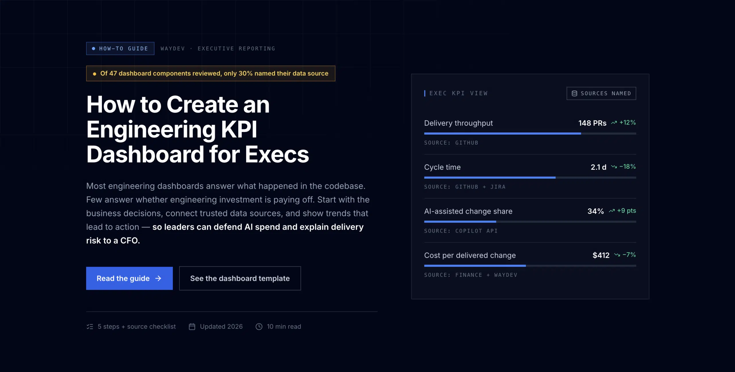
Most engineering dashboards answer what happened in the codebase. Few answer whether engineering investment is paying off. To create a custom engineering KPI dashboard for execs, start with business decisions, connect trusted data sources, and show trends that lead to action.
A review of 47 dashboard components found that only 30% named their data source. That gap matters when leaders need to defend AI spend or explain delivery risk to a CFO. The steps below show how to build a dashboard executives can read quickly and trust.
The first step in building an executive engineering KPI dashboard is to list the decisions it must support. Don’t start with a chart library or a long list of metrics.
Ask each executive what they need to decide. A CFO may need to assess whether the engineering budget is producing enough business value. A CTO may need to know if teams can meet a major release commitment. A board may want to understand delivery risk before approving a large AI investment.
Write each decision as a question. Then connect it to a small set of measures.
Keep the executive layer to four to six main metrics. More detail belongs in a leadership or team view. A board member should understand the current state within two minutes, then see where to drill down.
Translate technical terms before they reach the meeting. “Lead time for changes” can become “time from an approved decision to production.” “Change failure rate” can become “the share of releases that create rework or service risk.” The measure stays intact. The language changes.
Waydev recommends starting with the purpose of the dashboard before choosing metrics. Its CIO dashboard guidance also supports limiting the executive view to the information tied to business goals.
Set a review rhythm at this stage. Use a monthly cadence for the executive view. Use a weekly cadence for operating reviews. Avoid individual-level reporting. It can turn a business tool into a surveillance system and may cause teams to optimize the number instead of the work.
The right KPIs connect engineering activity to outcomes that executives already care about. A custom dashboard should show the path from delivery work to revenue, risk, cost, or customer impact.
Start with a small core set. DORA metrics are useful because they cover delivery speed and stability. Add AI measures only when they show more than usage. Seats, logins, and prompt counts don’t prove that an AI tool improved the business.
| Executive question | Useful KPI group | Business translation | Drill-down view |
|---|---|---|---|
| Can we meet the release plan? | Lead time, deployment frequency, predictability | Time to market and planning confidence | Team, product area, and release stage |
| Are releases safe? | Change failure rate, incidents, recovery time | Cost of rework, downtime exposure, and service risk | Service, incident class, and time trend |
| Is AI improving delivery? | AI-assisted work, review burden, rework | Useful output versus hidden verification cost | Workflow, work type, and system risk |
| Are we funding the right work? | Engineering cost, allocation, strategic progress | Investment fit and opportunity cost | Initiative, product line, and quarter |
| Is engineering healthy? | Quality, developer experience, and flow signals | Capacity, delivery risk, and retention pressure | Team trend, not individual rank |
For AI adoption, pair one usage measure with at least one outcome measure. For example, compare AI-assisted pull requests with review time and rework. If output rises but senior reviewers spend more time fixing errors, the tool may have moved cost rather than reduced it.
Define the formula before you build the card. State the numerator, denominator, time window, source, and direction of good performance. Also state what the metric cannot tell you. That last line prevents a single number from carrying more meaning than it deserves.
Waydev brings together developer productivity, delivery performance, code quality, AI adoption, and AI-tool ROI. Its enterprise dashboard capabilities support custom metrics and targets that match an organization’s own goals.

Use a table like the one above to test each KPI before it enters the dashboard. If a metric has no business translation, move it to an operational view. If it cannot be traced to a source, mark it as provisional.
In Waydev, leaders can use Ask Waydev to examine the story behind a signal. AI Checkpoints can help place AI activity in the delivery flow, while Signals can point to changes that need review. These features should support a leadership question, not replace judgment.
For a broader framework, consider established delivery measures through the delivery-measure overview. Use established measures where they fit, then add custom KPIs for your own investment questions.
A trusted dashboard needs a shared data model. That model should explain where each value comes from, how often it refreshes, and how teams are grouped across time.
List the systems of record first. Typical inputs include Git repositories, CI/CD pipelines, issue trackers, incident systems, cloud cost data, and AI tool logs. Map each source to the metric it supports. Don’t blend data until you know what each event means.
Define common terms in writing. “Deployment” might mean a production release in one team and a staging push in another. “AI-assisted work” might mean a prompt was used, or it might mean AI output remained in the final artifact. Pick one definition that can be checked.
Keep a metric dictionary beside the dashboard. Each entry should include:
This is where many dashboards lose executive trust. Seventy percent of the components reviewed did not name a data source, and 64% did not define a refresh cadence. A polished card cannot fix unclear provenance.
Use real-time refresh when a signal can change the decision during the day, such as a production incident or AI spend alert. Daily refresh is often enough for delivery trends. Monthly views should preserve a stable period close so the number doesn’t shift after a board packet is sent.
Choose one hierarchy for teams, products, and services. Then keep it stable. If a team moves between groups every month, the trend line will show an organizational change rather than a delivery change.
Separate facts from interpretations. A dashboard can show that lead time rose. An engineering manager still needs to explain whether the cause was a review queue, a security event, or planned platform work. Ask for that context before changing a target.
Waydev’s data model can pull from Git repositories, CI/CD pipelines, issue trackers, and AI usage logs. Its MCP integration can also help leaders bring engineering questions into the systems where decisions are made. The goal is a traceable path from source event to executive card.
Dashboard design should help an executive spot direction, risk, and the decision that follows. A custom engineering KPI dashboard for execs should not look like a wall of ticket counts.
Put the current state at the top. Add a trend line beside it. Then show the target and the gap. A number without a time frame is hard to judge. A number without a target is hard to act on.
Use a small set of visual patterns:
Only 13% of the reviewed dashboard components named a visual format. That is a missed design choice. The visual should match the question. Use a trend for direction, a table for investigation, and a scatter plot when two measures need to be read together.
Make tradeoffs visible. Suppose AI-assisted work rises while review time rises faster. Show both lines in the same decision view. Suppose reliability work consumes more capacity than planned. Show the allocation shift beside delivery predictability.
Use color with care. Blue can mark normal status. Amber can flag a trend that needs context. Red should mean a defined action threshold, not a bad feeling. Include text for users who cannot rely on color alone.
Waydev’s Predict & Improve workflows can help leaders move from a signal to a likely improvement path. Still, the dashboard should never present a forecast as a fact. Label forecasts, assumptions, and confirmed results separately.
Keep the first screen calm. If an executive must scroll through ten charts before finding the risk, the design has failed. Let the first screen answer three questions: Are we delivering? Are we healthy? Are we improving?
Validation turns a dashboard from a collection of charts into a trusted operating tool. Test the data, the meaning, and the behavior it creates.
Run a review with engineering, finance, product, and security. Give each person the same dashboard and ask them to explain what they would do next. If two leaders read the same card in different ways, fix the definition before launch.
Check the data against a known period. Compare deployment counts with release records. Compare incident values with the incident system. Review a sample of AI-assisted work and confirm that the attribution rule is being applied in the same way.
Then test for harmful use. Never use the executive dashboard to rank individual engineers. Don’t turn activity data into a personal score. Keep the executive view at team, product, service, and organization level. This protects trust and keeps leaders focused on system conditions.
Govern access by role. Executives may need the summary and investment view. VPs and senior managers may need team drill-downs. Teams may need operational data that helps them improve their own flow. Access should reflect the decision, not curiosity.
AI needs its own review loop. Track adoption beside quality and cost. If usage grows while rework or incident risk rises, pause the rollout and inspect the workflow. The right response may involve better context, stronger tests, tighter permissions, or a different use case.
Research on AI adoption KPIs makes the same operational point: usage alone is weak evidence. A useful scorecard connects tool telemetry with delivery artifacts, quality outcomes, operating cost, and financial impact. That is the difference between reporting adoption and measuring value.

Set a change rule. Review the dashboard each quarter. Remove cards that no one uses. Add a card when the same unanswered question appears in several meetings. Keep a record of metric changes so trend breaks have an explanation.
Waydev can support this cycle with custom metrics, AI Checkpoints, Signals, and Predict & Improve. We also work with organizations that need board-level visibility without exposing personal performance data. Trusted by companies including American Express, Dropbox, and PwC, Waydev has spent nine years in engineering intelligence, with a USPTO patent in Git analytics and recognition from Gartner and G2.
An executive engineering dashboard should include four to six measures tied to delivery, reliability, investment, and business outcomes. Useful examples include lead time, delivery predictability, change failure rate, AI-assisted work, review burden, and engineering cost allocation. Show team or organization trends, not individual activity.
An engineering KPI dashboard should use the refresh rate that fits the decision. Production risk may need near real-time data. Delivery trends often work with daily updates. The executive view usually benefits from a monthly review, with weekly operating views for leaders who need to act sooner.
You measure AI adoption by linking tool use to delivery artifacts, quality, cost, and business impact. Track meaningful AI-assisted work instead of logins alone. Then compare it with review burden, rework, change lead time, incidents, and AI spend. High usage is not success if the total delivery system gets worse.
Executive dashboards should not show individual engineer metrics. Individual activity can create surveillance pressure and distort behavior. Use team, service, product, and organization-level data instead. This gives leaders enough visibility to find process issues while preserving context and trust within engineering teams.
A trustworthy dashboard names every data source and metric formula. It also states the refresh cadence, owner, time window, and known limits. Leaders should be able to drill from a summary card to the underlying team or system data. Without that path, a clean visual may still produce weak decisions.
Build the dashboard around executive decisions, not available data. Start with a small set of business-linked KPIs, document every source, and add AI measures only when they show delivery, quality, cost, or ROI. A platform such as Waydev can give large engineering organizations the shared data model and drill-down view needed for that work. Begin with one board-level question, then test the first six metrics against it.
Ready to unlock your SDLC productivity?