
CIO dashboards are standard tools that tech executives use to assess their teams’ activities and follow the progress in their day-to-day operations. While their value is significant at IT organizational levels, many companies aren’t making the most of these powerful KPI tools. This translates into weak premises for decision-making and influences the activity, strategy, and plans.
Waydev enables CIOs, VPs of engineering, and engineering managers to scale their operations by efficiently integrating comprehensive dashboards into their strategies. An efficient CIO dashboard consists of metrics that create a clear view of operational, business, financial, security, development, and QA key performance indicators. We foster a data-driven environment that continuously monitors performance, identifies risks and opportunities, and helps execs take the best decisions at the right time.
To help you create the best CIO dashboard for your organizational needs, we will walk you through the objectives and benefits of these control panels, as well as through examples for best practices. We will also detail the key CIO dashboard metrics that help you understand, at a glance, your department’s activity and showcase how each metric helps you monitor and plan your work. This article will offer you accurate, applicable insights on how to optimize your activity using CIO dashboards. Also, we will showcase how CIO dashboards help businesses understand the work of technical teams, how budgets are spent, and how to assess performance.
A CIO dashboard is a central panel that allows IT leaders to monitor a company’s information technology systems and programs, focusing on the most important metrics and indicators that offer a clear view of the daily operations and the state of the infrastructure.
By using CIO dashboards, IT leaders assess whether their technologies and workflows meet business objectives. They gain the necessary information to make reliable decisions that affect their team’s activity and the organization. The panel works by breaking down complex information into easy-to-understand, clear KPIs that may be evaluated, benchmarked, and compared across different periods.
Many software development leaders use a CIO dashboard. However, only high-performing engineering executives build well-configured panels that they consult daily to achieve the best results. This enables them to manage big teams, juggle responsibilities, and deliver the highest quality.
The most valuable elements in a CIO dashboard are the metrics that reflect the evolution of the developing process’ critical stages. It is essential to choose metrics wisely, consider your operational flows and priorities, and access them in real-time.
With Waydev, you can keep track of the KPIs vital to scalability and ensure you always know what is happening. You get a clear view of their team’s output and work habits, as well as valuable insights on your codebase. This enables you to ensure that every action you or your team takes is based on documented facts and figures.
CIOs and other engineering managers and executives can use CIO dashboards to get insights into their organization’s top business drivers and measure their department’s performance in delivering results.
Nowadays, the role of engineering spans beyond a department that turns concepts into reality and uses technology to deploy systems. Developing and engineering departments are a company’s innovation center, so they need to understand the organization’s and the stakeholders’ needs and develop ideas that deliver value.
Engineering managers play a valuable part in business decisions, as, through their insights, they support decisions connected with resource allocation and the financial budgeting of a project.
By using a CIO dashboard, engineering leaders benefit from complete visibility on what is happening inside their teams and may see the status of their projects in real-time. This means that they may easily detect potential staffing, security, and project-related bottlenecks before the situations escalate.
Since this enables them to act in time, apply the necessary measures and see their results step-by-step, the departments register fewer crises, more rapid response times, and significantly less pressure on the teams.
CIO dashboards ensure constant updates, with information one click away for IT leaders and their teams. With a comprehensive overview of commit, PR, CI/CD, and ticket activity, engineering managers don’t have to spend time gathering, analyzing, and updating data, thus, streamlining their activity.
With automated processes, engineering managers can focus on their tasks. They may use their working hours for activities that bring added value, such as taking prompt, well-documented decisions that bring essential changes.
For engineering managers, transparency means more than just access to information. It’s also about clear metrics showcased visually attractive and easy to read and understand. This is where CIO dashboards come in.
Waydev enables you to construct your CIO dashboard with essential metrics so that you quickly find the information you need by merely scanning the control panel.
Moreover, our solution puts information in context, enabling decision-makers to understand how their companies and IT departments stand compared to different periods and benchmarks.
CIO dashboards support better, faster decision-making by providing and displaying vital operational indicators. Dashboards simplify the process by enabling engineering leaders to track precise metrics that they may access at any time and compare.
Although there isn’t a one-size-fits-all approach, these are some best practices to be used when creating your CIO dashboard:
Because dashboards builders manage to comb through a large amount of data and generate KPIs, there is a general tendency to create dashboards that emphasize many metrics. This puts your work at risk because it creates much clutter, making critical information less visible, defeating this central panel’s actual purpose.
Our recommendation is to always start with the “why?” and focus on the objectives of the dashboard you are creating. Once you limit yourself to the data that truly matters, you will ensure that the panel is an efficient, helpful tool that makes a difference in your activity and creates value instead of adding more background noise to what is already happening.
We are all familiar with UX and its importance in development projects. CIO dashboards are another area where user experience is crucial because you need to ensure that the professionals working with this panel get the most benefits.
When creating your CIO dashboard, you have to know how your audience will be using the dashboard, what terminals, and how they will view it. By assessing all this information, you will learn how to organize data and information, how much context to add, and how to combine visuals.
Dashboards can help you know everything and anything about your systems and infrastructure but can lead to information paralysis. Creating a dashboard is not about adding countless metrics but about identifying the best metrics that are relevant for your business. To do so, you need to correlate it with your business requirements and goals.
A well-constructed dashboard informs business leaders how the software development budget is spent and supports its operations. This makes the work of developing teams more visible, easier to understand and assess because it translates it into clear metrics that are compared over time.
Storyboarding defines the actual process of planning a CIO dashboard and is similar to a screenplay for movies. Storyboards present content to audiences, focusing on sequence – the order in which information is presented to the user – and the visual format.
The CIO dashboard storyboarding process includes the following four steps:
The four steps give you a clearer, more visual view of how your CIO dashboard will look and bring you closer to the final result.
When it comes to CIO dashboard metrics, there is a substantial number of options from which you may choose. Here are the top categories:
Operational metrics focus on how teams work in production and efficiency in delivering and maintaining software. They enable tech leaders to identify when something is not advancing, flows are blocked, and releases are at risk. Operational metrics also pinpoint the moments when changes need to be made to ensure a good distribution of resources and a reconsidering of processes.
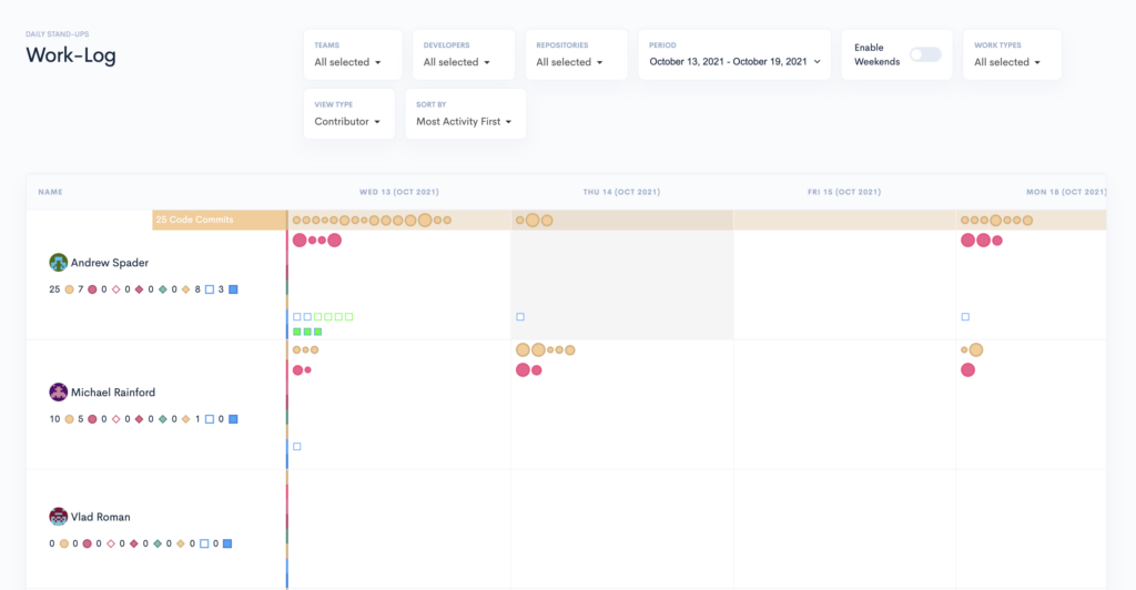
Active days measure days when developers contributed code to the project. This metric doesn’t include other tasks, which come as a result of administrative and planning responsibilities. Its purpose is to understand the actual cost associated with interruptions.
Waydev’s Work Log is a valuable feature that can help engineering managers understand individual engineer contributions and each team member’s work patterns. Moreover, it showcases code and merged commits, the status of PRs (open, closed, merged), or PR comments & reviews.
Code churn defines the number of code lines modified in a specific period, within a 3 week timeframe. Code reiterated might signal that a particular project requires assistance, and tracking Code churn can pinpoint the issues.
Productive throughput, expressed as a percentage, measures how much code is free from churn.
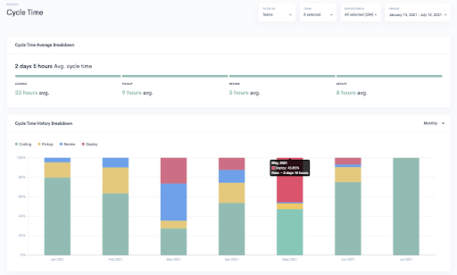
Engineering Managers compare the changes of a branch with the repository’s master branch for valuable and actionable metrics. They can track and measure individual metrics like Time to First Comment, Time to First Review, or Merged Pull Requests.
Software development delivery metrics help you measure and keep track of your team’s progress and performance, showcasing the delivery standard and the issues. These include
Code metrics focus mainly on the dynamics of lines of code, code complexity, instruction path length (defined as the number of machine code instructions necessary for executing a computer program).
With Agile metrics like sprint burndown, epic and release burndown, and velocity, engineering managers foster their teams’ productivity during the different stages of the development process.
DORA metrics represent an industry standard for efficient software delivery and monitoring improvement. The methodology helps tech leads assess the current state of their teams, set objectives for the coming months or full year, and identify techniques for increasing performance.
Engineering Managers use DORA metrics to measure performance and see if they fall into the low, medium, high, or elite performers benchmarks. The methodology takes into account the following metrics Deployment frequency (DF), Lead Time to Changes (LTTC), Change Failure Rate (CFR), Mean time to recovery (MTTR).
At Waydev, we understand that successful CIO dashboard examples emphasize the financial aspects. Our Projects Costs report is designed to showcase the costs associated with the project’s progress and the number of contributors.

Security metrics focus on how vulnerable the system is and the chances for malware attackers to penetrate it and create disruption. High-performance CIOs track a series of security metrics on their dashboards:
In the engineering landscape, vulnerabilities are weaknesses that may open for hacker attacks. They are mainly generated through flaws in code and features delivered.
Time to resolution defines the time it takes to approach and resolve a cybersecurity threat.
Deployment of updates defines the time required to implement new features which lack the identified vulnerabilities.
While the number of security incidents is an intuitive metric, severity might require an introduction. Severity metrics measure the impact that each incident has on a particular organization.
The Risk metric assesses the chances that a specific commit might generate issues. Waydev identifies risk by checking patterns and searching for potential problem-causing anomalies within commits.
Waydev helps you create a well-executed CIO dashboard that provides the best premises for strong decision-making, integrating different metrics and bringing them together into a single panel. Comparing KPIs with their targets and previous values enables you to have a good outlook on the IT and engineering landscape.
Waydev’s reports help you gain visibility on the work that engineers perform and measure efficiency at an organizational level. If you want to understand to what extent you align with the business initiatives and how you may optimize your development processes book a demo with us.
Ready to unlock your SDLC productivity?