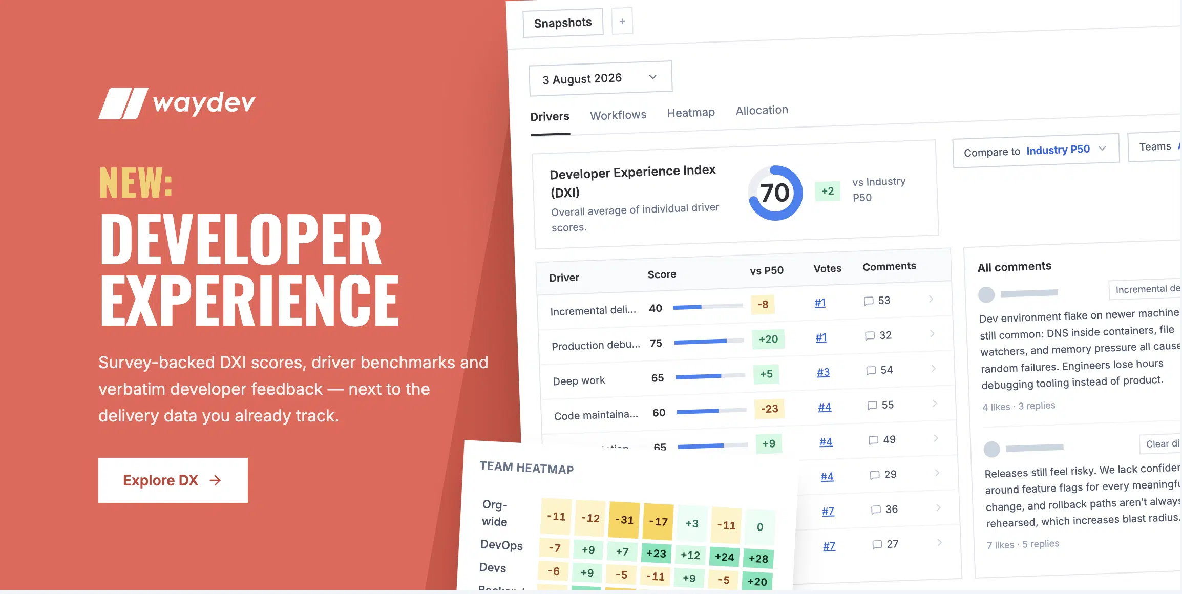
Waydev is launching a new set of Developer Experience features, and Snapshots is at the center of them. System data tells you what your organization ships. Snapshots tell you what it is like to build it.
Until now, Waydev has measured engineering from your systems: delivery metrics, AI adoption, AI impact, and AI ROI. That data is objective, but it only captures outcomes. It cannot see the hours lost waiting on CI, the context switching that fragments deep work, or the documentation that has drifted from reality. Those frictions drain delivery capacity every single week, and no system records them. Only your engineers can.
Snapshots close that gap. They survey your engineers directly, score the results, benchmark them against industry percentiles, and break them down by team. Run them on a regular cadence and you get a trend line for the parts of engineering work that system data never captures: waiting, unclear direction, tooling friction, and the daily cost of understanding unfamiliar code. Combined with Waydev’s system-based metrics, you get the full picture: what your teams deliver, how it feels to deliver it, and what the friction between the two is costing you.
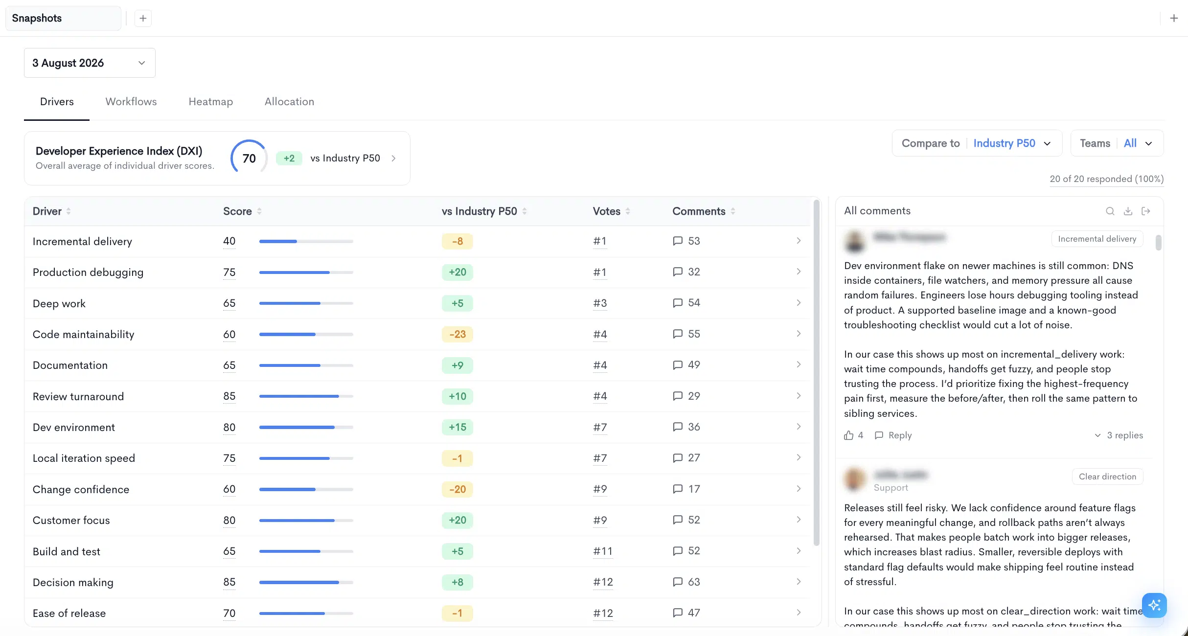
Each survey round produces one snapshot, identified by its date. Every score, comparison, and chart anchors to a specific snapshot, and switching snapshots in the date selector moves the entire view to that point in time. That makes a snapshot a true point-in-time record. You can compare Q3 against Q2 and know you are comparing like with like.
A snapshot moves through four stages.
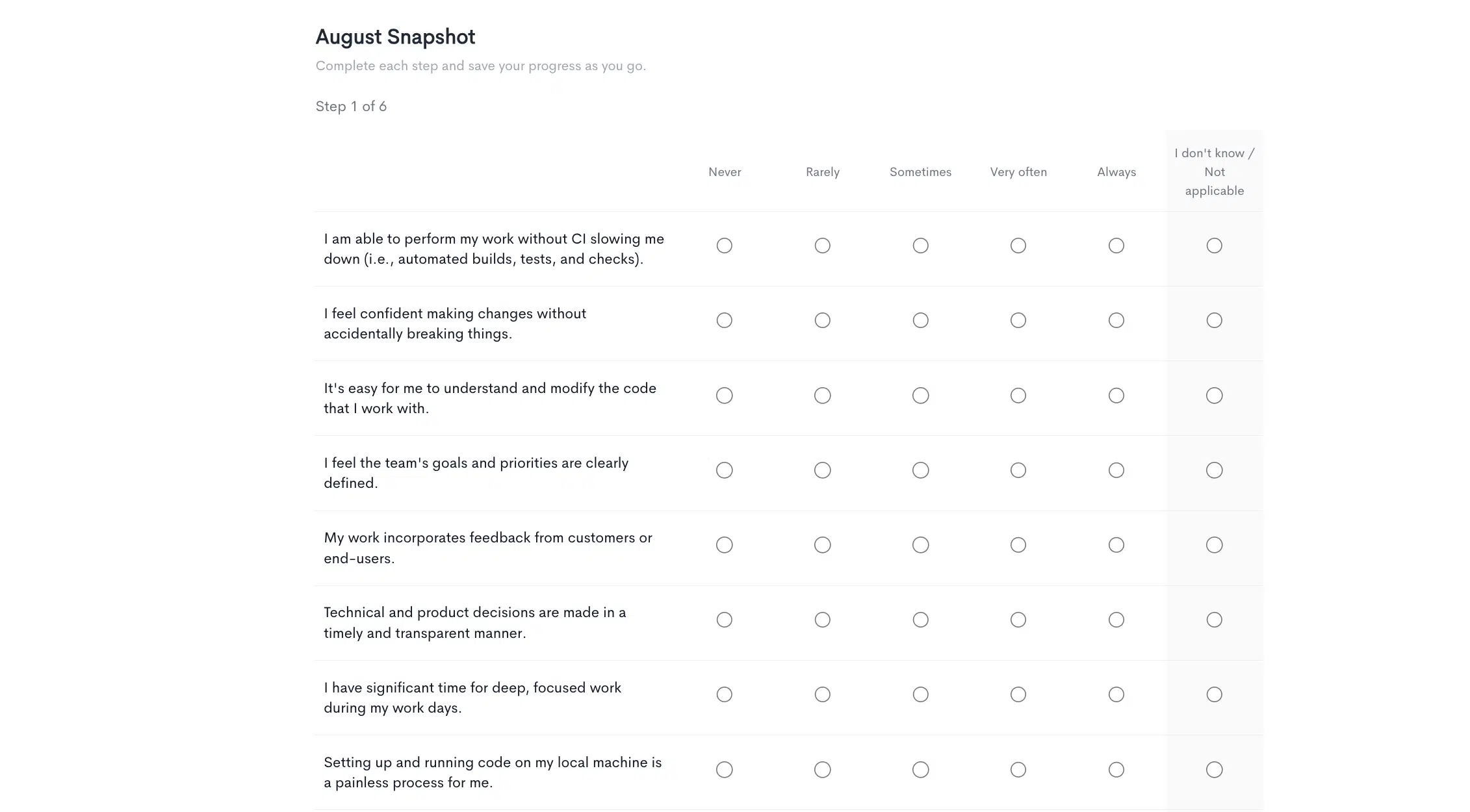
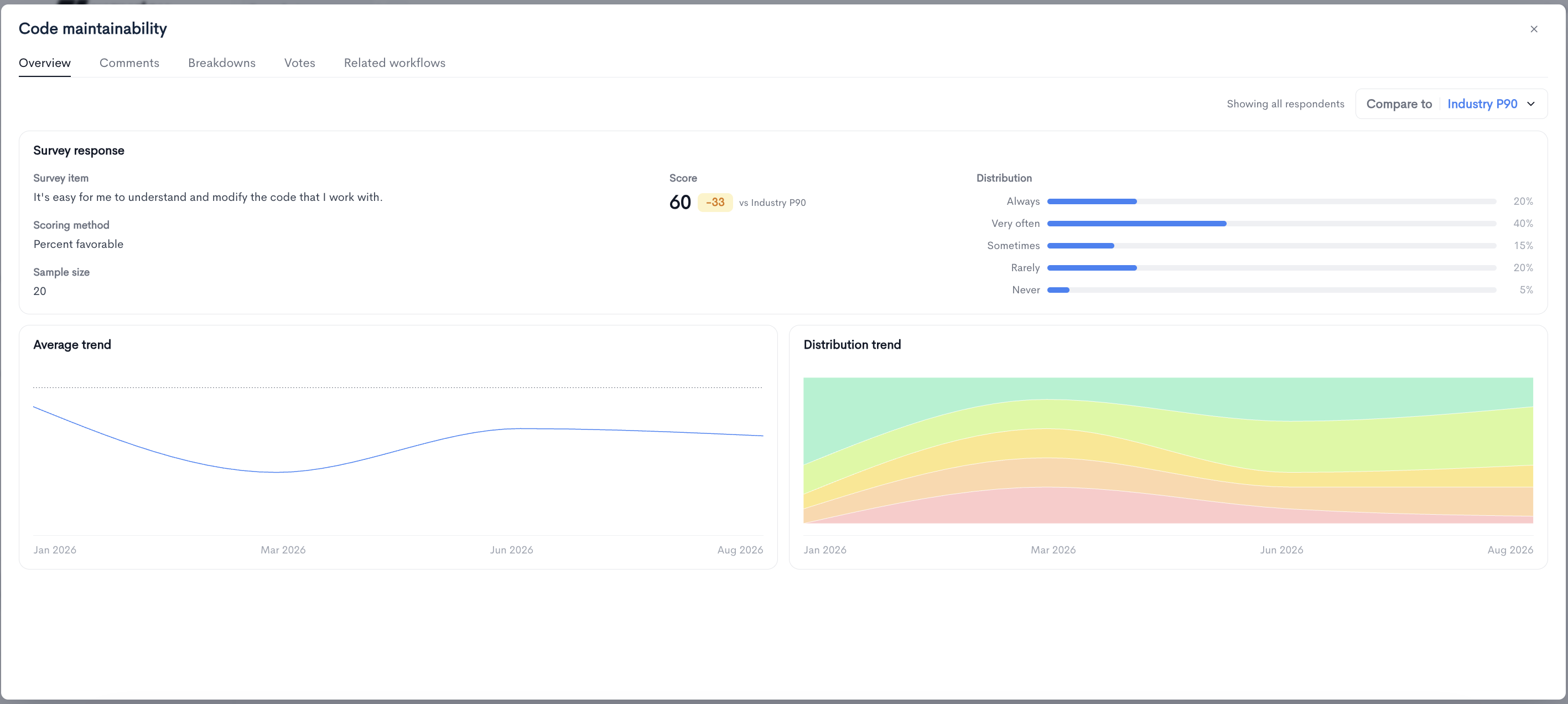
Drivers are perception questions about the conditions engineers work in. Code maintainability, review turnaround, deep work, documentation, dev environment, ease of release. Each driver maps to a single survey statement, and respondents answer on a five-point frequency scale from Always to Never.
Driver scores use the Percent favorable method: the score is the percentage of respondents who chose one of the two most positive options. A driver scoring 60 means 60 percent of respondents answered Always or Very often. Two consequences follow from this that are worth internalizing before you read your first snapshot.
First, scores move in visible steps on small teams. On a team of four, one changed answer moves the score by 25 points. That is why a team of four can score 25 on the same item where the organization scores 60, and why sample size should sit next to every team-level number you read.
Second, a score of 0 means every response was unfavorable. It does not mean the question went unanswered. Zero is a signal, not a gap in the data.
Workflows are quantitative questions about how much time an activity consumes or how often it happens. Respondents pick a bucket rather than typing a number, for example 2-4 hrs/wk, and the reported values average into a single figure in its native unit.
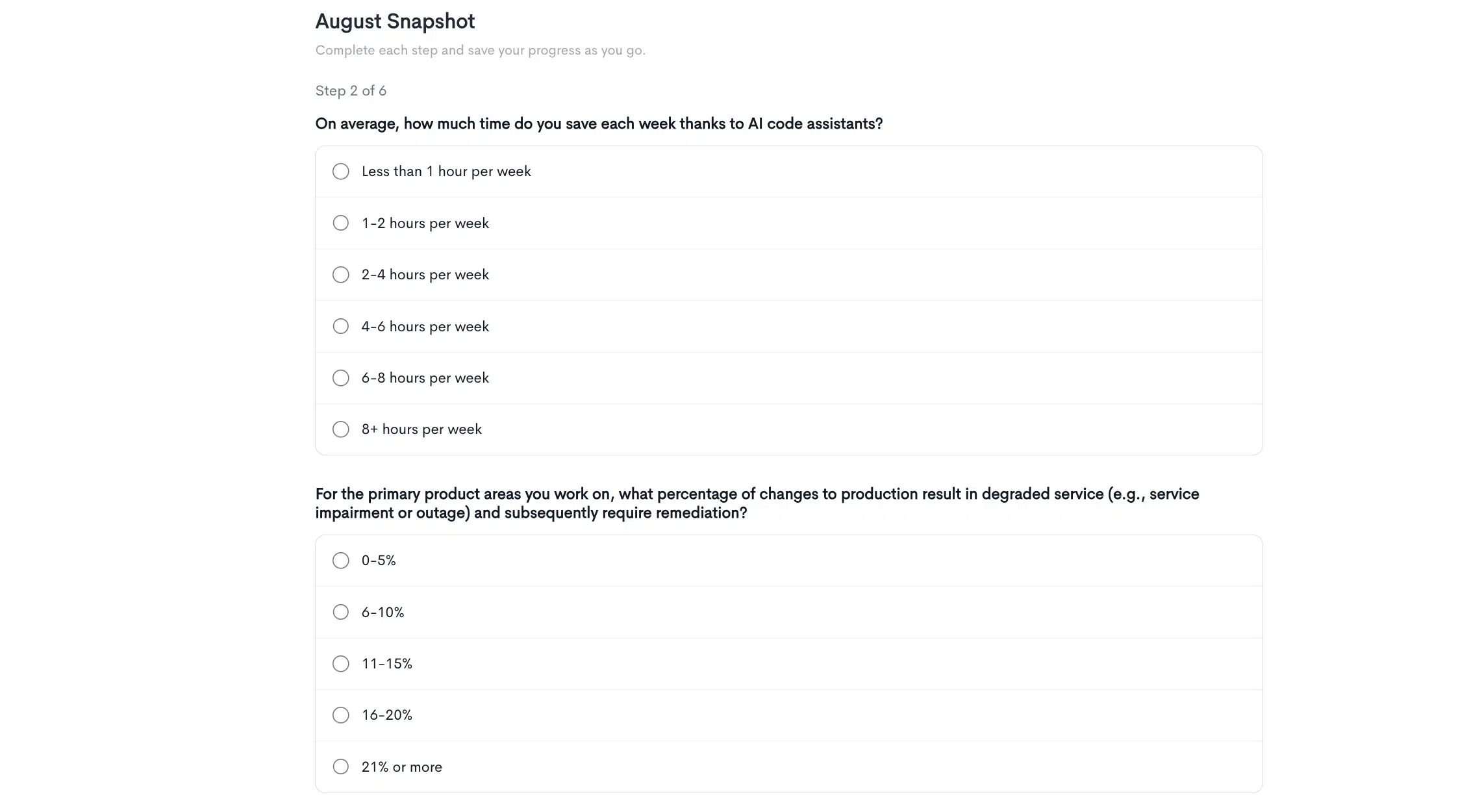
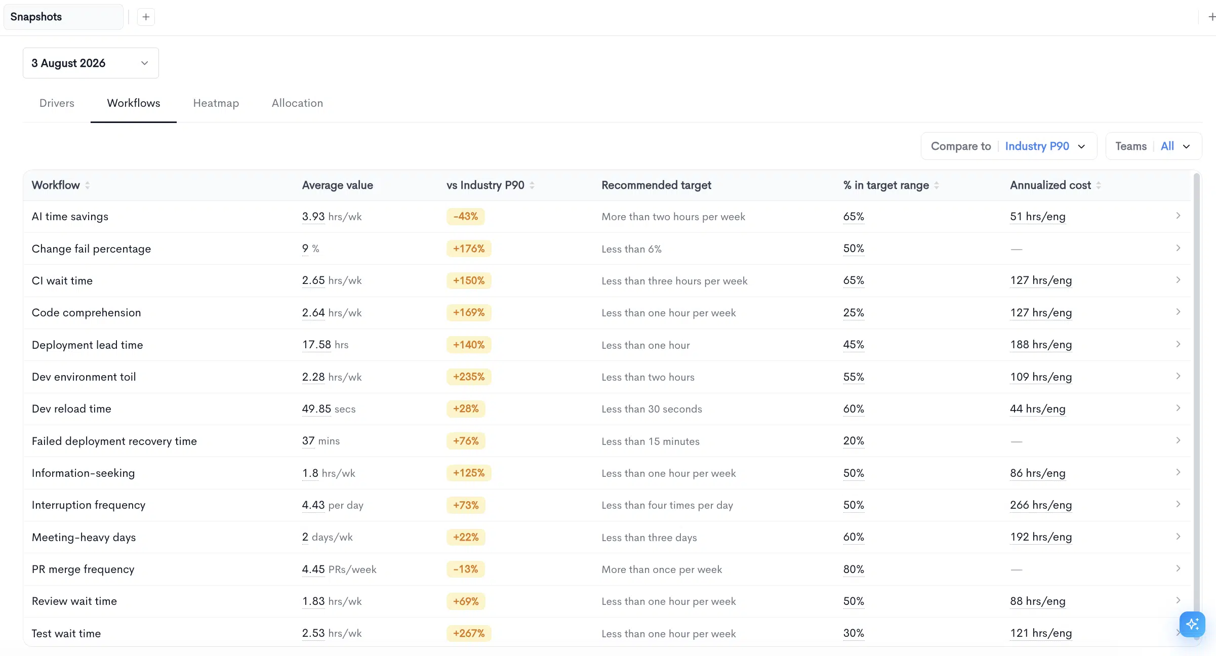
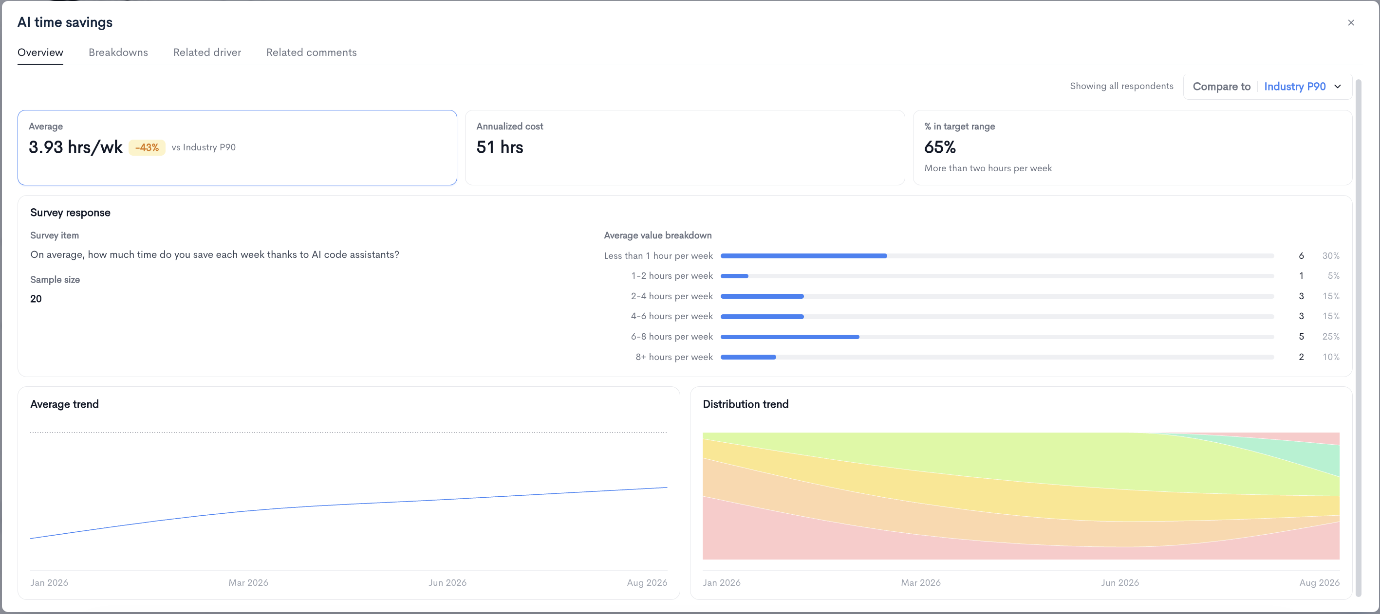
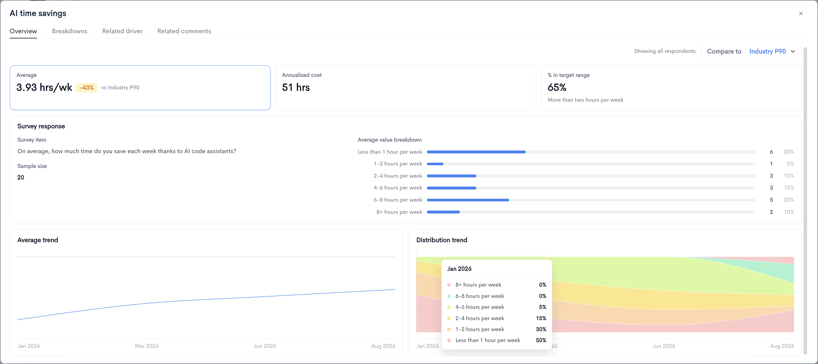
Each workflow carries a recommended target, such as less than one hour per week for review wait time. The % in target range figure shows the share of respondents whose answer lands inside that target. For AI time savings, where the target is more than two hours per week, a 65 percent in-range figure is the sum of everyone answering 2-4, 4-6, 6-8, and 8+ hours.
Two things matter when reading workflow deltas. The comparison is expressed as a percentage difference rather than a point difference, because workflows are measured in hours and counts rather than on a fixed scale. And for most workflows, lower is better, so a positive percentage against the benchmark indicates worse performance, not better. Workflows where more is better, like AI time savings and PR merge frequency, invert that reading.
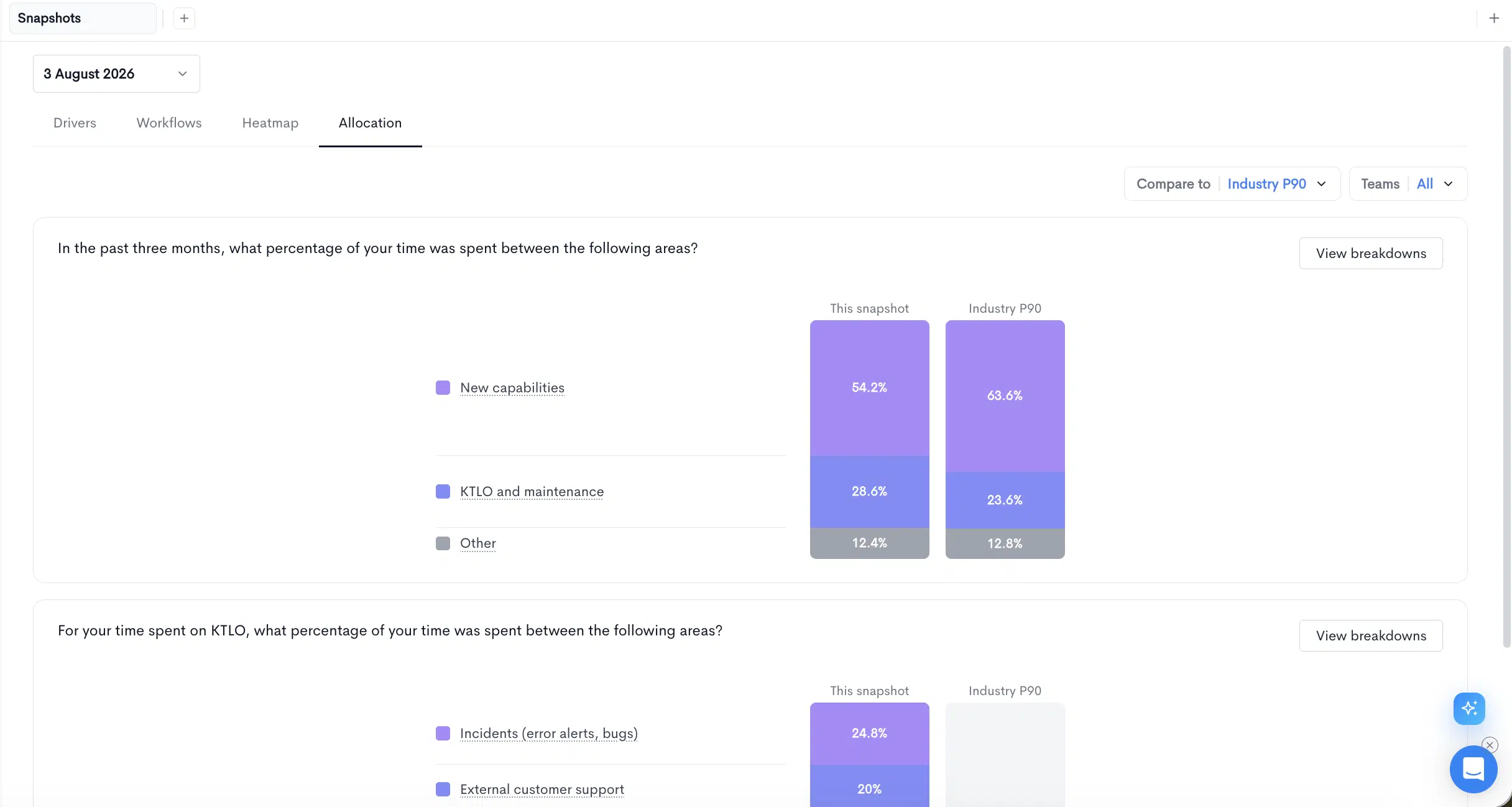
Allocation questions ask respondents to divide their time across categories as percentages: new capabilities, KTLO and maintenance, other. Answers display as stacked bars next to the same split for the benchmark, so you can see at a glance whether your engineers spend a materially larger share of their time on maintenance than comparable organizations.
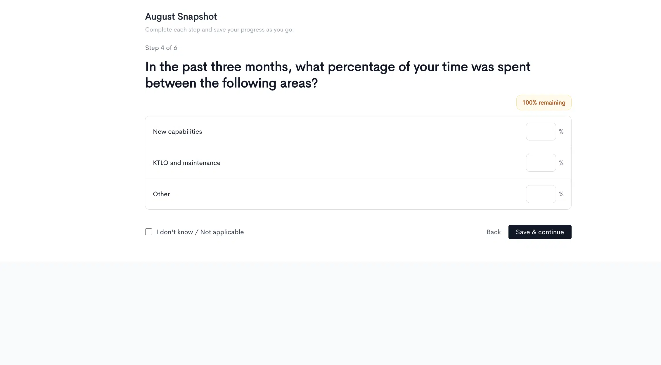
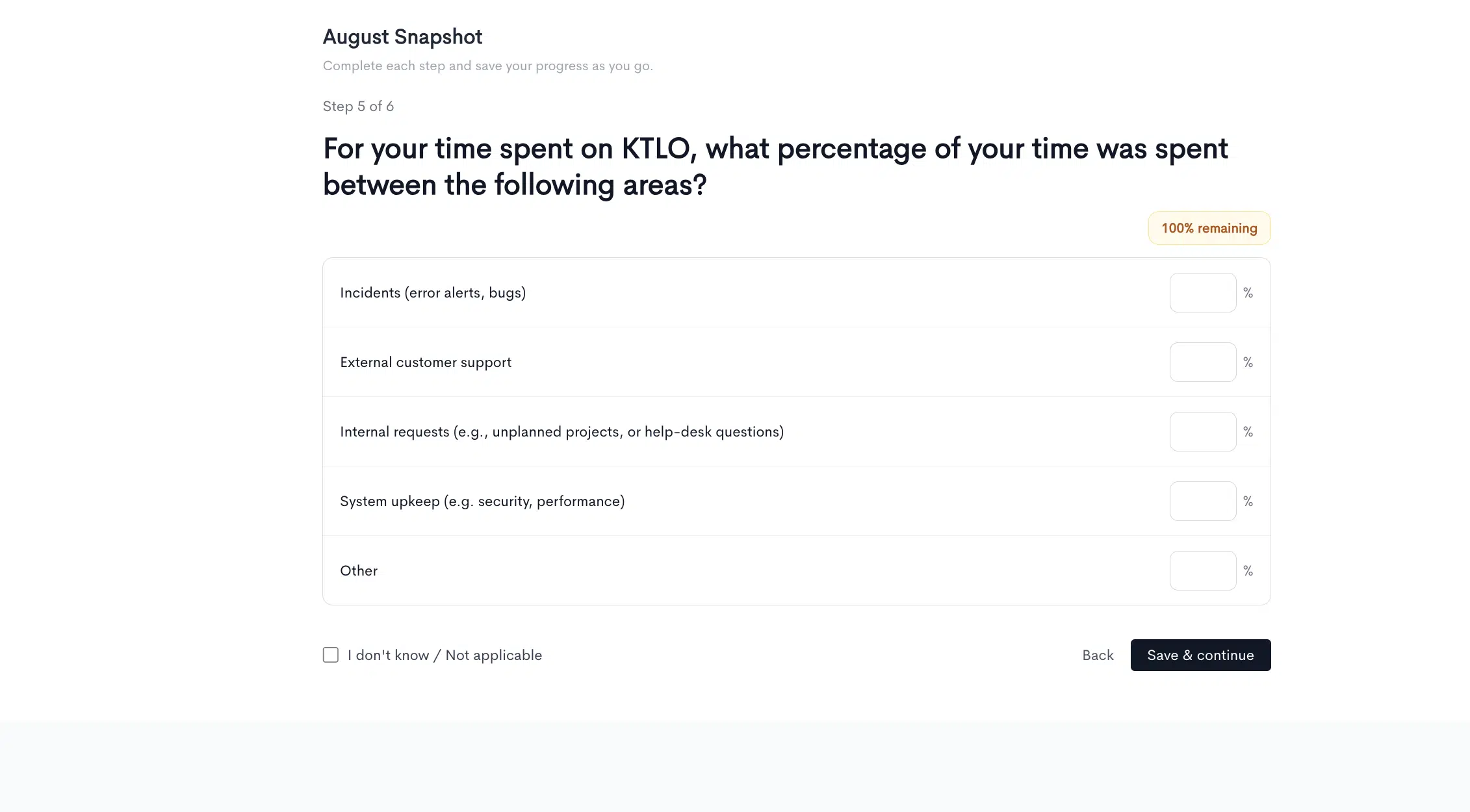
Allocation questions can nest. A follow-up question can break down a single category from a previous answer into finer detail, so “maintenance” can decompose into incident response, dependency upgrades, and toil.
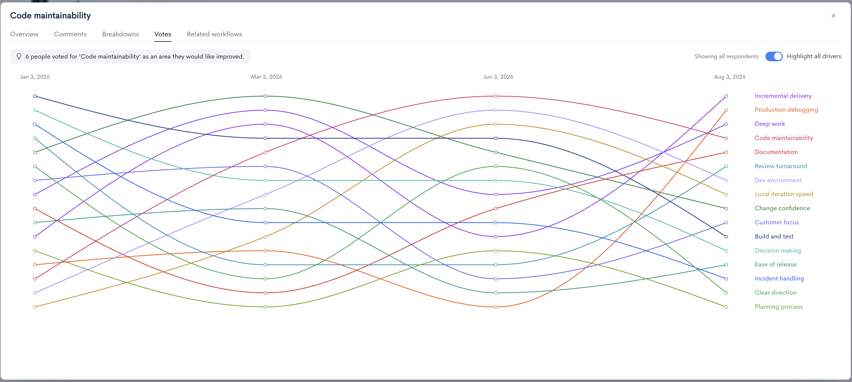
Alongside rating each driver, respondents select the areas they most want improved. Votes are independent of scores, and the gap between the two is often the most useful signal in a snapshot. A driver can score reasonably well and still attract the most votes. That usually means it is not broken, but it is the thing standing between your engineers and getting work done.
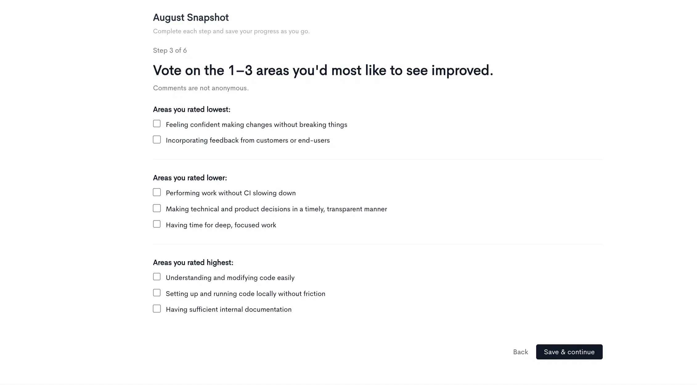
Vote rank is tracked across snapshots, so you can watch priorities reorder over time as fixes land and new friction appears.
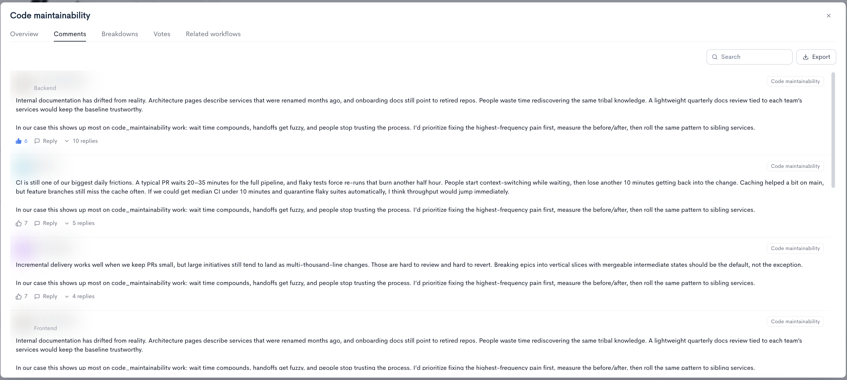
Comments are free-text responses tagged to the driver they relate to. Each carries the author, their team, and the driver tag, and supports likes and threaded replies, so managers can acknowledge feedback and follow up in place rather than exporting it into another tool.
Comments are the layer that makes a score actionable. A code maintainability score of 60 tells you there is a problem. The comments tell you it is stale architecture documentation and multi-thousand-line pull requests.
The DXI is the overall average of the individual driver scores in a snapshot, expressed as a single number out of 100. It exists so developer experience has one figure that can be tracked quarter over quarter, compared against the industry, and reported upward without asking your CFO to read sixteen separate driver scores.
Treat the DXI as a summary, not a diagnosis. It tells you whether things are improving. The driver scores, votes, and comments tell you what to do about it.
Context for every scoreEvery score in a snapshot displays next to its difference from an industry benchmark, selected with the Compare to control. Industry P50 compares you against the median organization and answers whether you are behind or ahead of typical. Industry P90 compares you against the top decile and answers how far you are from best in class.
Switching the benchmark changes every delta on screen but never changes the underlying score. A driver sitting at +9 against the median can sit well below zero against the top decile, and both readings are correct. Use P50 to find problems and P90 to set ambitions.
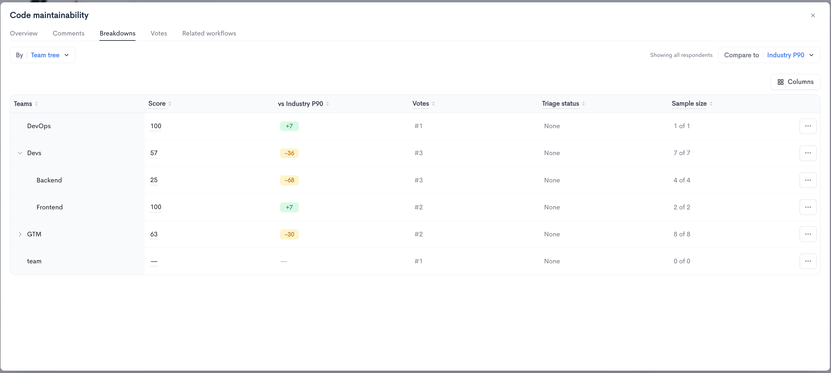
From org to teamEvery driver and workflow breaks down by team, following your team hierarchy. Parent teams show an aggregate and expand to reveal their child teams, so a director sees the rolled-up picture and a team lead sees their own.
Sample size displays as responses received out of people surveyed, and it should be read alongside every team-level number. A team of one scoring 100 and a team of eight scoring 63 are not comparable results. Small teams will always produce more extreme scores than the organization-wide figure.
Because snapshots repeat, every driver and workflow carries two trend charts. The average trend shows the score or value across previous snapshots: direction of travel. The distribution trend shows how the shape of responses has changed, as a stacked area chart.
The distribution trend is often the more informative of the two. An improving average can mean everyone got slightly better, or it can mean a small group moved a long way while the rest stayed put. Those are two different stories with two different follow-ups, and only the distribution tells you which one you are in.
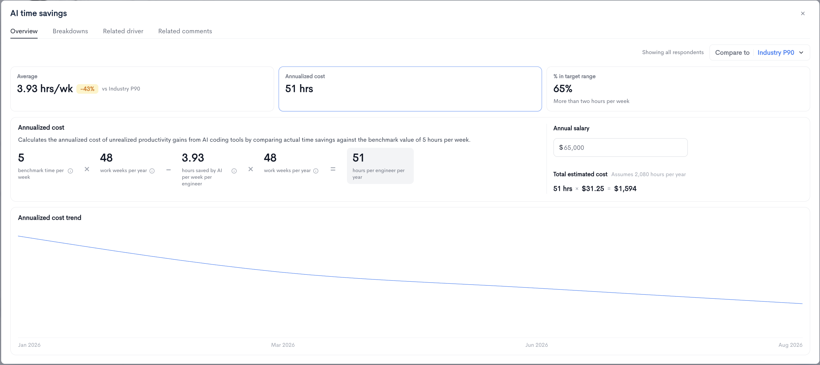
Workflow results translate into a cost estimate so friction can be discussed in the same terms as everything else that competes for budget.
The calculation takes the gap between your reported average and a benchmark value, multiplies it by 48 working weeks, and produces a figure in hours per engineer per year. Enter an average annual salary and that converts into money, using an assumption of 2,080 working hours per year to derive an hourly rate.
The output is an estimate for framing a conversation, not an accounting figure. Its value is in making the comparison concrete. A workflow costing 127 hrs/engineer/yr is easier to prioritize against a tooling purchase than a survey score of 2.64 hrs/wk. Not every workflow has a cost model: those measuring rates and frequencies rather than time, such as change fail percentage and PR merge frequency, display a dash in the cost column. If you are building the business case for your AI program, this pairs directly with our AI adoption framework for CTOs.
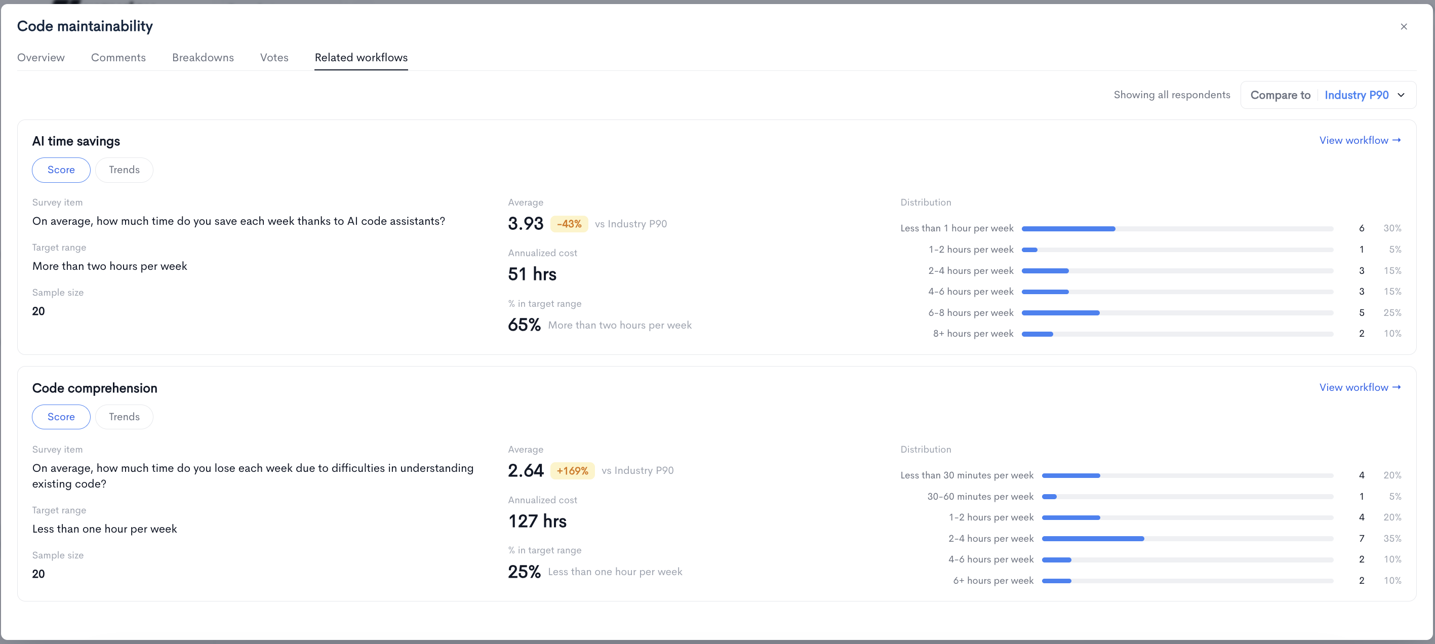
Drivers and workflows measure the same problems from two directions, and they are linked in the product. Each driver lists its related workflows, and each workflow lists its related driver, with a link to move between them.
Code maintainability. The judgement: engineers rarely feel the codebase is easy to work in.
Code comprehension. The measurement underneath it: hours per week lost to understanding existing code.
This pairing is what turns a perception score into a diagnosis. When the two agree, you have a well-evidenced problem. When they disagree, that gap is worth investigating on its own.
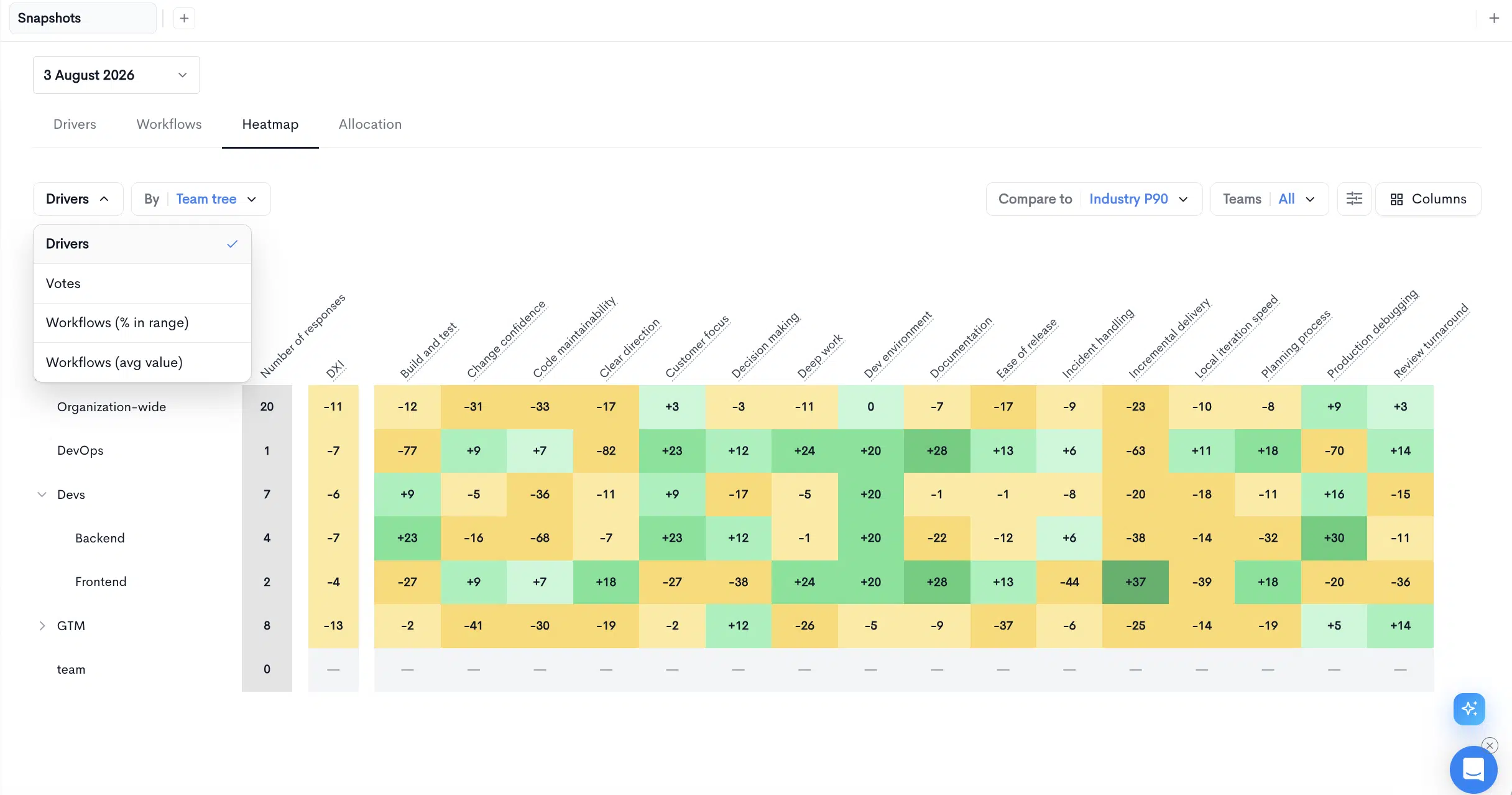
The Heatmap answers the question of where a problem is concentrated. It grids every team against every metric and colors each cell by its distance from the benchmark. An issue affecting one team shows up as a band of amber in a single row rather than being averaged away into the organization-wide score.
The heatmap switches between driver scores, votes, workflow target ranges, and workflow average values. That lets you check whether a low score, a high vote count, and a poor workflow measurement all land on the same team. When they do, you have found your next initiative.
Driver breakdowns include a triage status per team, so managers can record what they intend to do about a result. Triage is what separates a survey program from a survey habit. It converts snapshot output into an owned decision, and it gives the next snapshot something to be measured against.
The complete pictureSnapshots make Waydev a more complete way to measure engineering. System data tells you what your organization delivers. Snapshots tell you what it is like to work inside it, what your engineers want fixed first, and what the friction is worth in hours and dollars. Survey, score, benchmark, break down, decide, then run the next snapshot to see whether the decision worked.
Snapshots are available now in Waydev, alongside AI Adoption and AI ROI. Full product documentation lives at docs.waydev.co.
Ready to unlock your SDLC productivity?